Google Maps gets a cleaner look and starts highlighting areas of interest

It’s been a busy week for the Google Maps team. As we reported earlier today, the Google Maps apps are getting a WiFi-only mode and the team is also bringing more crowdsourcing tools to the mobile apps as well. The company kept the biggest announcement for today, though: Google Maps on iOS, Android and the web is getting a new and cleaner look with a more subtle color scheme.

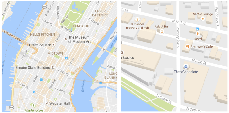
The idea behind the new look for the maps is to remove clutter. As Google notes, the team removed road outlines, for example, and also improved the typography on the maps so it’s easier to read street names, points of interest and transit stations.
At the same time, the team also decided to try a new way of showing local information on the map. When you zoom in to a city now, you’ll likely see a few areas that are shaded in orange. These are “areas of interest” that feature a large number of hotels, restaurants, music venues or other points of interest.
Google says it uses algorithms to determine these areas, but at times, it’ll also use human editors to highlight certain parts of a city.
As for the new color scheme, Google says it wanted to go for a more “subtle and balanced” look.
I’m not seeing the updates just yet, so chances are the company is still in the process of rolling this new look out to all of its users. The new design definitely looks cleaner, though, and fits Google’s over design theme, which has recently focused on removing visual clutter.
Google Maps gets a cleaner look and starts highlighting areas of interest
 Reviewed by Unknown
on
13:17:00
Rating:
 Reviewed by Unknown
on
13:17:00
Rating:
No comments: